Release Notes 1.3.0
Welcome to the Claro Analytics Archived Release Notes! If you were looking for info about our most recent product updates, select the option at the bottom of the box to the right. Otherwise, feel free to read the below update and learn about some interesting existing Claro Analytics features!
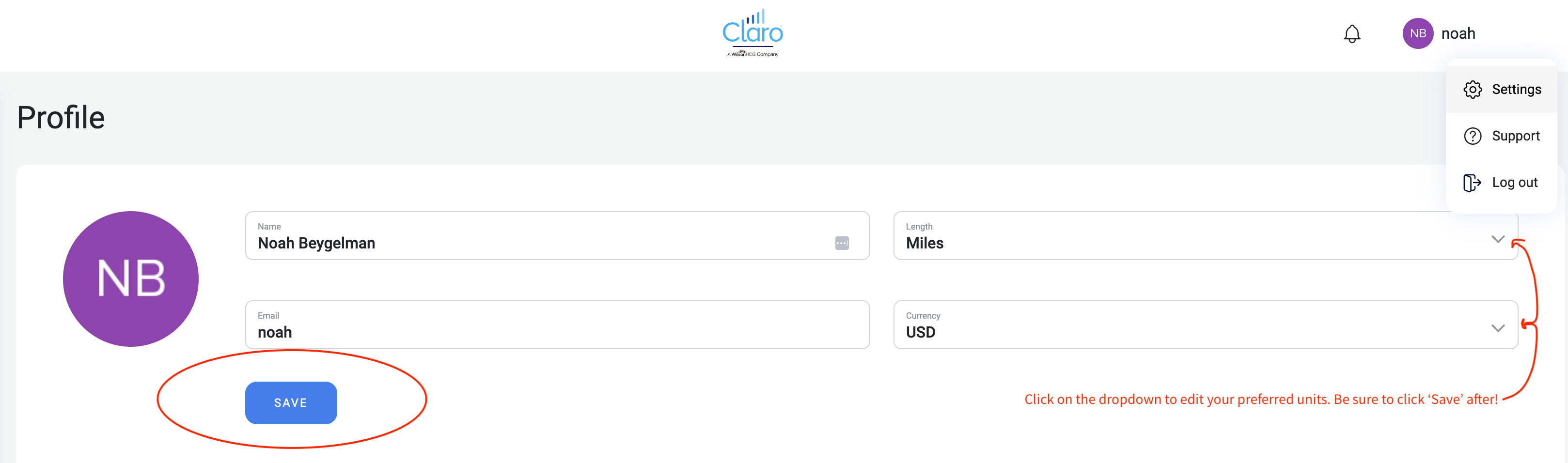
In this release, we focused on expanding our salary view to include more detailed information and edited the settings to add the ability to change the default unit of length and currency for all searches in your account.
Salary chart additions:
- Salary Distribution – This chart aggregates all the current salary data from job postings and divides the salaries into distinct ranges to show which salaries make up the largest percentage of the group. To adjust the size of these salary range groups, click the Option Gear in the top right-hand corner of the chart area, and use the slider to increase or decrease the width of each salary range: moving to the right will make the salary ranges more narrow, and moving the slider to the left will make the salary ranges wider. You can also add labels to the bars in the chart in this Options menu, and you can alter the Y axis from total number of jobs in each salary range to the percentage of total jobs that fall in each salary range.
- Salary Trends – This chart aggregates salary data stored over the past year to display a trend of the average salary each month within that 1-year period. You may see data ranging back longer than a year in some searches, but most searches will return a trendline showing the changing path of the average salary for the past year. To enable labels for this chart, click the slider in the top right-hand corner of the chart area.
- Salaries by Job Title – This chart shows the salary distributions of each job title contained within your search results, sorted in descending order by how many open jobs have that specific job title. This chart may take a few seconds longer to load than the other charts due to the larger volume of data to represent, but don’t worry, it’s worth the wait! To see the salary distribution of one role in the list, click the bar that corresponds to that job title.
- Salaries by Company Size – This chart shows the average salaries for roles offered by companies of 3 different size groups: Small, Medium, and Large.
Revised user settings:
- We added the ability for you to swap your default unit of length between miles and kilometers for location-based searching most appropriate to your region and familiarity.
- We added the ability to shift between different currencies by clicking an option from the dropdown list. Regardless of the currency the job posting originated in, you will see the same empirical value in the currency you selected, converted based on the daily rate.